Overview
Caring.com is the second largest senior living referral service, designed for caregivers seeking information and support as they care for aging loved ones. There are several facets and products to the business.
I designed and product managed everything from our email marketing program, sem marketing program, and SaaS products.
My Role
Design Director
Product Management, Product Design, Marketing Management, Conversion Optimization
The Problem
The company was struggling to gain customers under a content-marketing driven subscription model. Instead of being the source of senior living information, they wanted to become the largest referral service for assisted living and in-home care. To do this, they would need a specialist in conversion optimization to help them build a successful marketing funnel.
They also needed to overhaul several products to appeal to their not as technicnally-savvy demographic.
Assessing assets from the subscription model
As mentioned all of Caring.com's previous concent marketing was educational. "Click to find personal care for your loved ones," "5 ways you can help a family member with dementia."
While this information is definitely helpful, it doesn't drive clicks or action. You can Google this information for free.
My idea was to create clearer call to actions that would drive clicks and conversion. Instead of click to receive personalized care, the message should have a value proposition. More on that later.
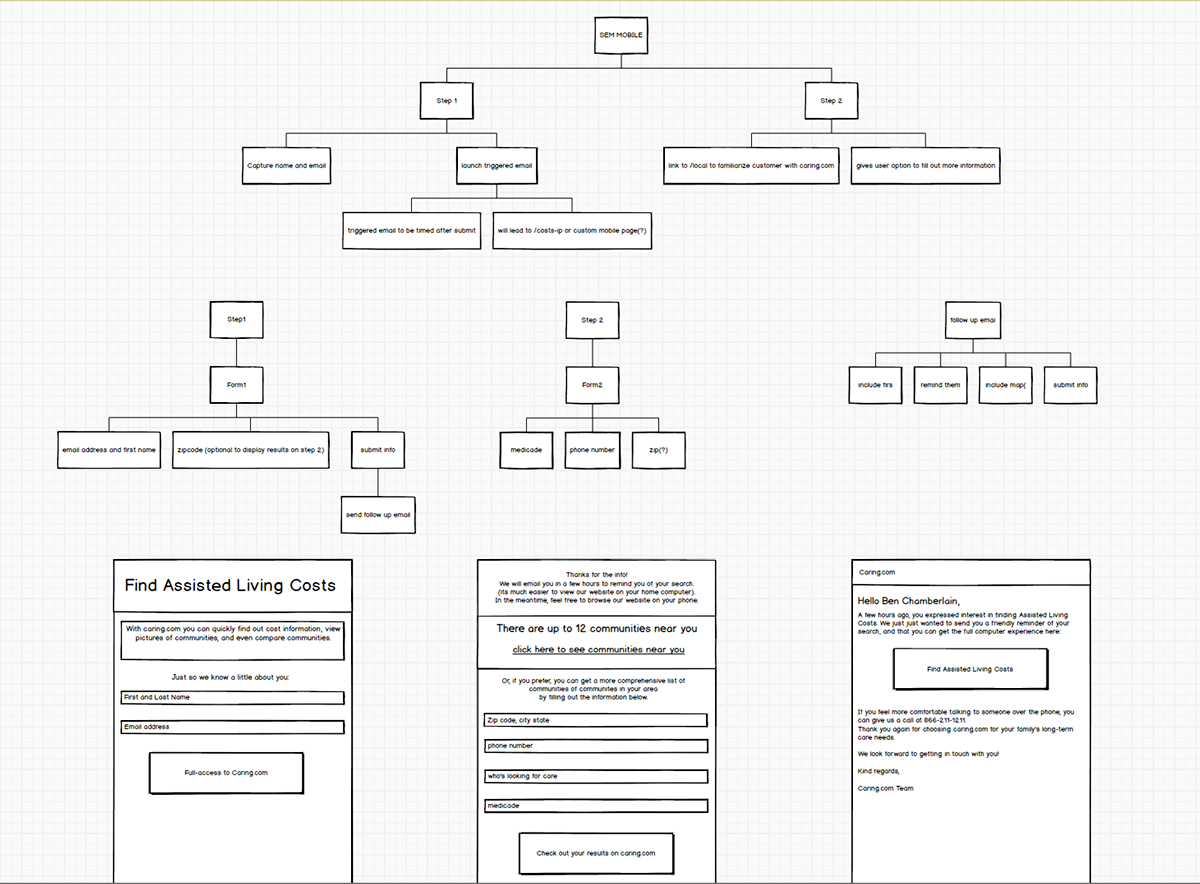
Building a conversion funnel from scratch
Caring.com had never conducted an A/B test for any of their landing pages, emails, or software UI. My role extended far beyond just designing landing pages and emails. I surveyed testing platforms, colaborated with engineering, and built systems to track new leads.
Collaborating with Engineering to create the best A/B testing solution
We conducted tons of resarch on tools available and concluded that there was no way to conduct a clean test with tools such as Optimizely. At that time, Optimizely used javascript to control image and copy tests. There would be a flash that would display tested content over the other. How would we know what the user acted on to convert? Image test A or B?
Our solution was to build an in-house URL splitter where we could route specific percentages of traffic to different urls. We could also control which segment, service, (AL or in-home-care), or demographic goes to which landing page so we could build refined pages for different cohorts.
What deserves to be tested?
I was used to getting a directive from my manager to "come up with a bunch of designs and we'll rifle them through our tool". This time around was very different. Andy and I were very calculated about what we wanted to design and build so we woudln't expend resources on tests that may potentially fail.
We assigned an optimum cost per click based on channel, and what it would cost for them to move down the funnel. This would help us determine what to build for which segments, and at what point in the funnel it would be best to spend design and engineering resources.

What information are our potential customers seeking?
Now that our systems were in the right place I built a survey that users could access through the confirmation page of our previous landing pages to unveil what they really wanted when they visted a site like caring.com. Did theyd want educational content? Or did they want to move mom into a home asap? Did they know what they were looking for in an assisted living home? Or do they need guidance?
"Educational content is imortant but I want information right away. I have heard assisted living is expensive. My husband and I don't have very much saved but we want to make sure my mom has a great end-of-life experience."
"My dad and I are super close. I want to make sure he has the best assisted living home possible. I just have no idea what the best places are around me. I wish there were reviews and photos like Yelp."
Time to test, (finally)!
After several sprints of Product Management and setup I was aching to design something.
The higher-ups were apprehensive to go against the grain, even given the user research. We would test two variants against the control.
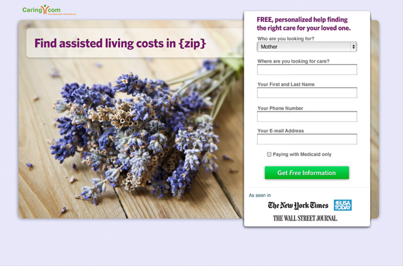
Control
- Headline: Get FREE Assisted Living Information
- Image: Lavendar Flowers
- Form fields: Long list
Test A
- Headline: Get FREE Assisted Living Information
- Image: Seniors having fun
- Form fields: Long list
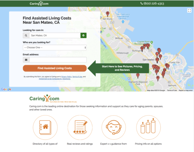
Test B
- Find Assisted Living Costs in {location}
- Image: A map of AL homes near them
- Form fields: 2 step flow. Step 1 would capture zip code, who they were looking for, and email address. If they abandoned the page on step two at least we could send an abandonment email.
The landing page I designed and built (in HAML) was a landslide victory. The previous landing page had a conversion rate of 6.64%. The new landing page, deemed "Costs" Had a 12.6% conversion rate.
Moving into SaaS and Product Management
This was an exciting time for me. After a few years of focusing on conversion I was granted the opportunity to dive into full-stack product design. The CEO and Director of Product and I would have quarterly planning meetins to disucss high-level business objectives. It was up to him and I to define and build viable products to solve these problems.
I love product management. I was involved in everything from identifying the epic, breaking it down into stories, pointing these stories, and writing specs for engineers and even myself, since I was still the primary UX/UI designer. Below is a summary of some of the products I worked on.
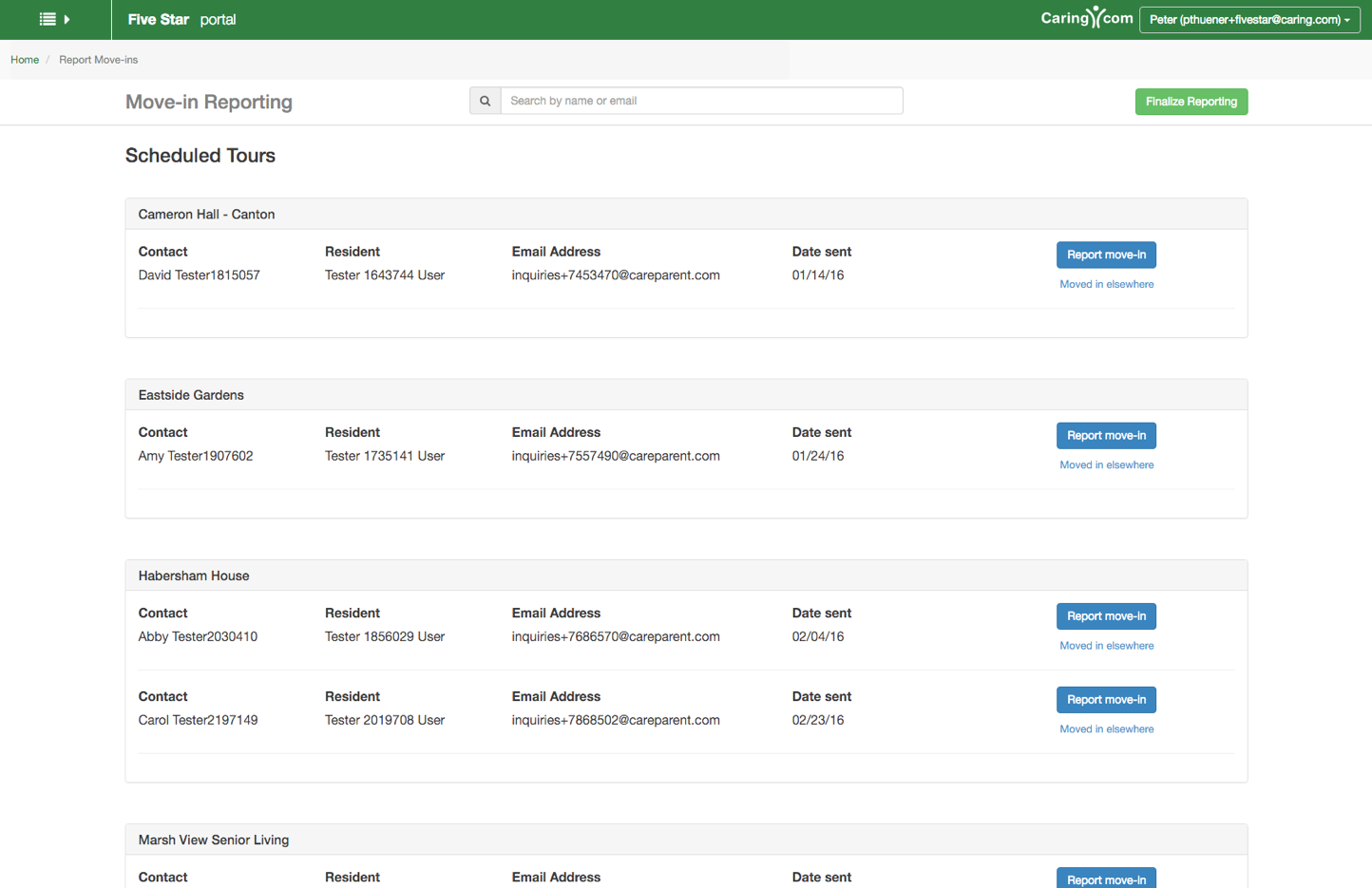
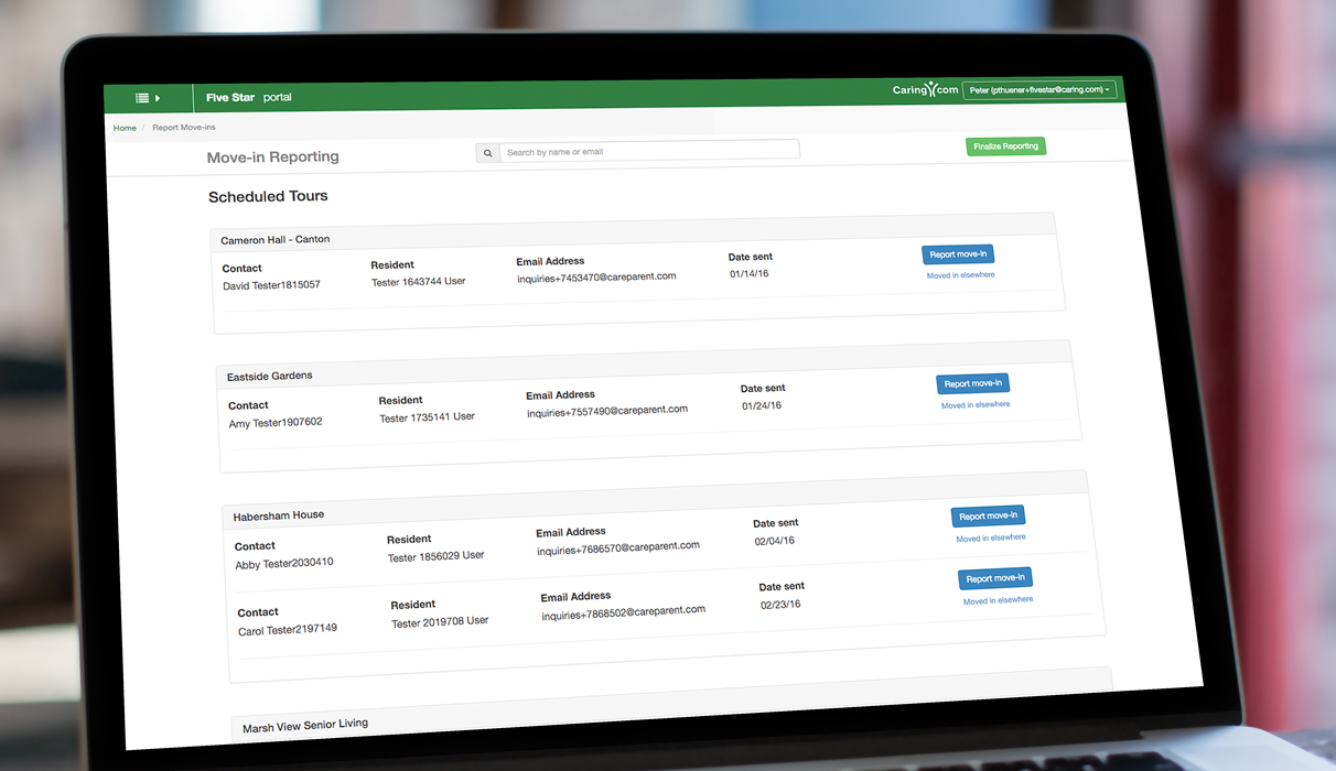
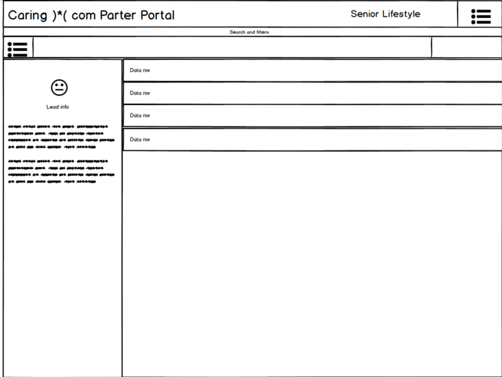
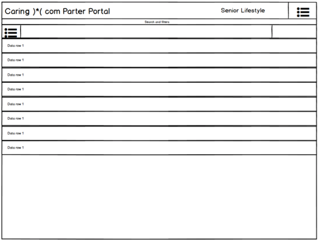
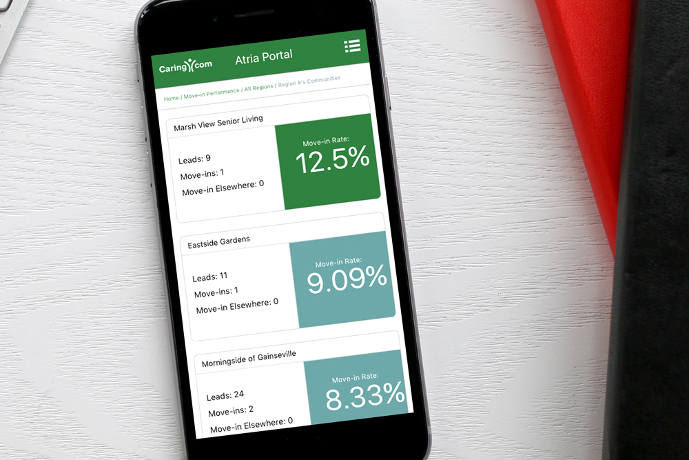
The Partner Portal and Move-in Reporting Tool
- View leads complete with customer profiles, contact history, and contact information
- The ability to update their rates which would update live on our providers page
- The ability to report move-ins
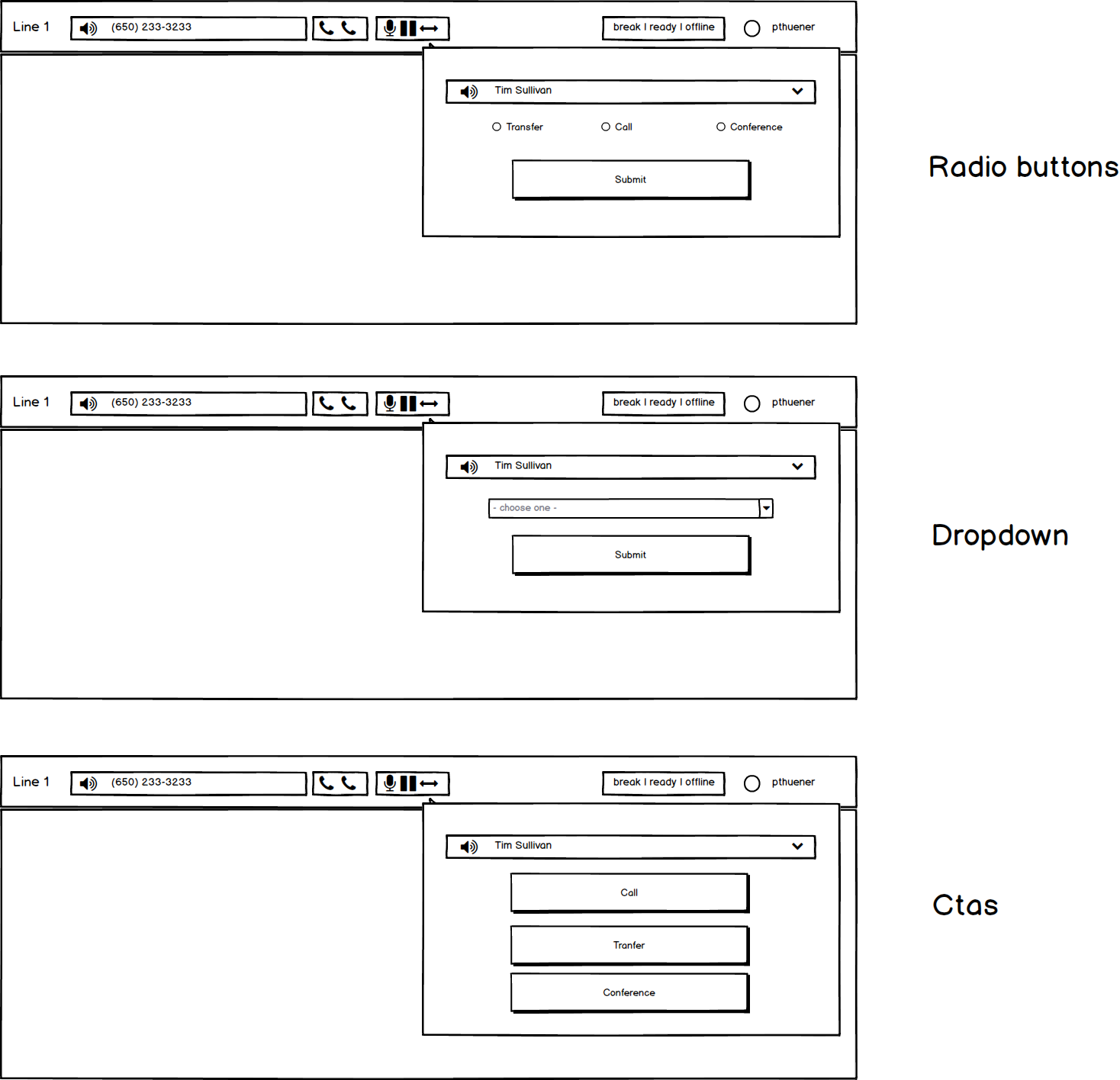
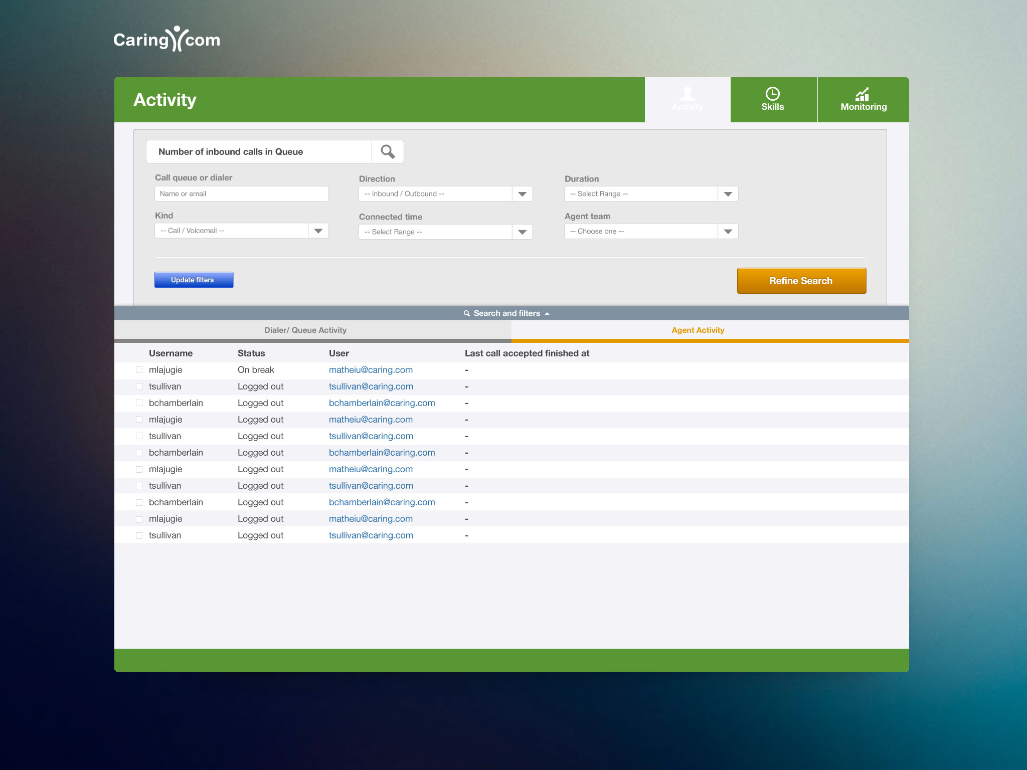
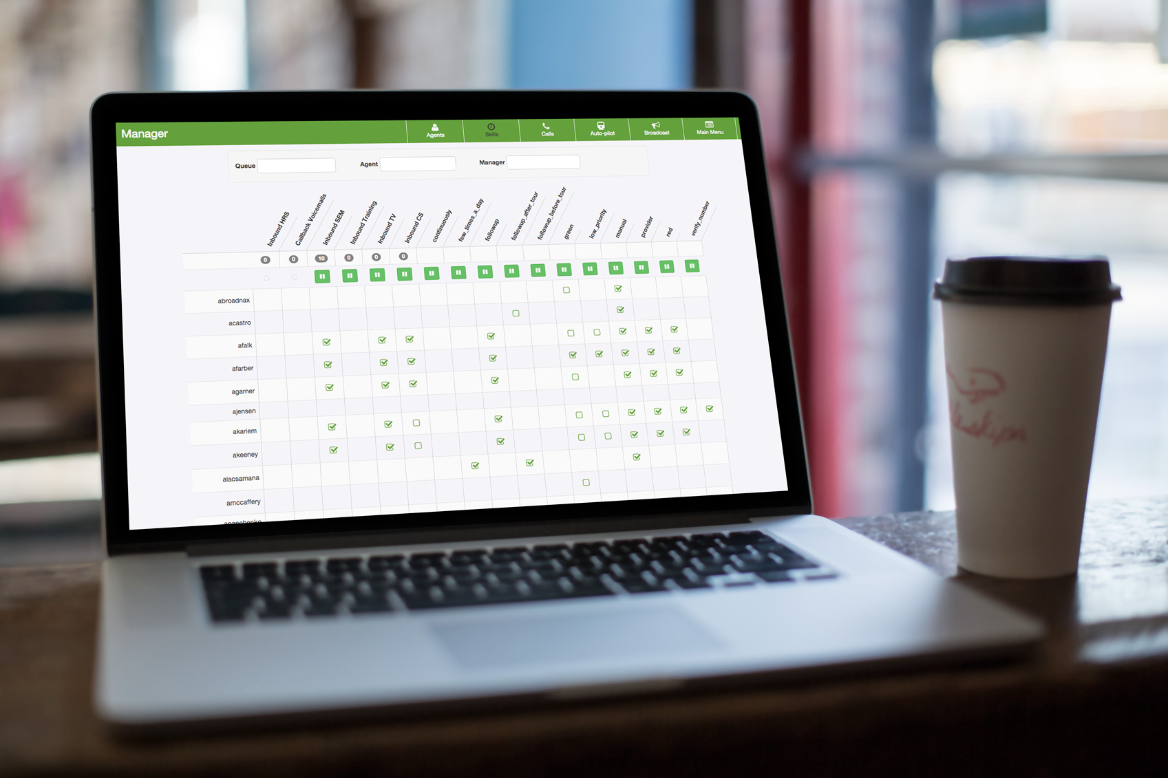
An entire call center! (We called it Contact)
Our current software, 5-9, was buggy and had frequent outages. It also did not link directly to our in-house CRM, talk. We wanted to add a Salesforce-like layer to expedite the Agent workflow. This product was 6 months in making. It had the agent ui where each sales individual could track their calls, set dispositions, and status, and more impressively, the manager ui, where managers could track things like:
- Agent state - online, offline, on break
- State duration - how long has the agent been on break or on a call
- Queues - what channels agents were currently assigned to
- Tactics - assign a method to the agent based on seniority, cold calling, follow up, etc
- Skills - the ability to assign agents to specific traffic channels
Measuring Success
I had a hgue impact at this startup. The company had a beautiful social mission. I learned a ton. Here are some metrics gathered from my time at caring.com.
14.1%
Best performing landing page converison rate
100%
Adoption rate of portal and contact
2016
Acquired by Bankrate
22oz
Ribeye I ate with the CEO of Bankrate
Follow up after initial conversion
After someone signed up for our service on the landing page but didn't respond to our first phone call I built a drip campaign. I designed and built emails and deployed them through SendGrid. We tested email design here as well, varying templates based on UTM codes. I would track these codes in a spreadsheet to find the optimial design, and best date and time to send to receive maximum conversion.