Overview
GoFormz is a full-platform product that allows users to transform any paper form into a digital form. Our bread and butter vertical was construction and their primary use case were inspection forms. GoFormz however is not limited to a single vertical. Our goals for expansion included two major initatives. Create a product for SMB and Enterprise customers that would allow them to deploy forms to users without a Goformz account, and create products that would make our platform indispensible that would reduce the customer's likelyhood to churn.
My Role
Senior Product Designer
User Research, Interaction, Visual design, Prototyping & testing, Front-end development
The Problem
Like any SaaS company the majority of our customer base was small-to-medium sized businesses. We had dozens of key Enterprise accounts that were driving the company's growth. We wanted to build products that would grow our Enterprise segment but would also benefit the SMB users. Additionally our existing technology stack and platforms were not optimized to support the features we need to build out to meet business goals and objectives.
My objective was to enforce and scale our design system across multiple platforms to then create new products and features for web and mobile that would expand our SMB base and drastically expand our reach to Enterprise customers.
Creating and evolving a cross-platform design system
GoFormz is a multi-platform product. There are several web-based products, iOS applications, an Android application, and even a Windows application. Developers at GoFormz have a native-first interaction design approach so it was important to respect native design systems while enforcing GoFormz ethos and styles across all of these platforms for consistency, cohesion and brand recognition.
When I joined GoFormz the product team was undertaking two huge tasks. One was a major code refactor of our web-based applications from node.js to react. This would require updating the design system with new styles and components that would be compatible with new react styles. The second was shaping up the beta Android app so it could be released to production. This would require creating several new interactions and components that would respect and leverage Material Design while maintaining GoFormz brand aesthetics.
Once the design systems were solidified for web and mobile I could scale them across new Enterprise products we would create later on which are also outlined in this case study.
Updating styles and components to modernize our webapp from node.js to react
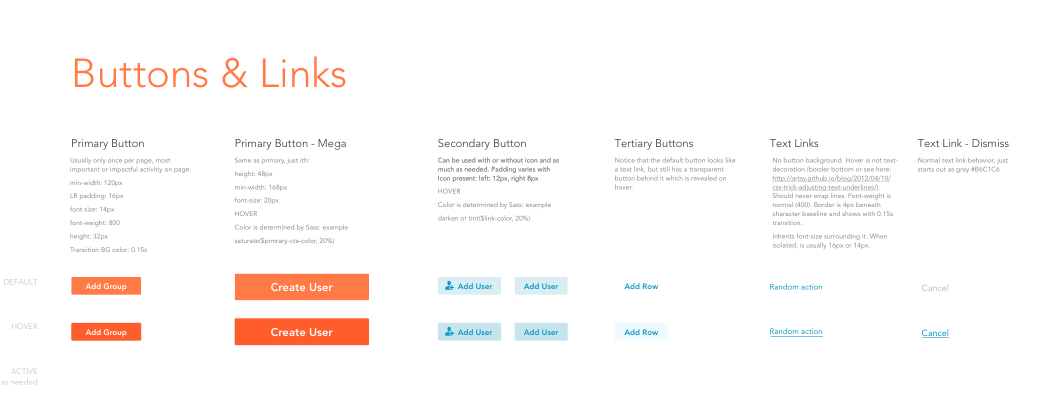
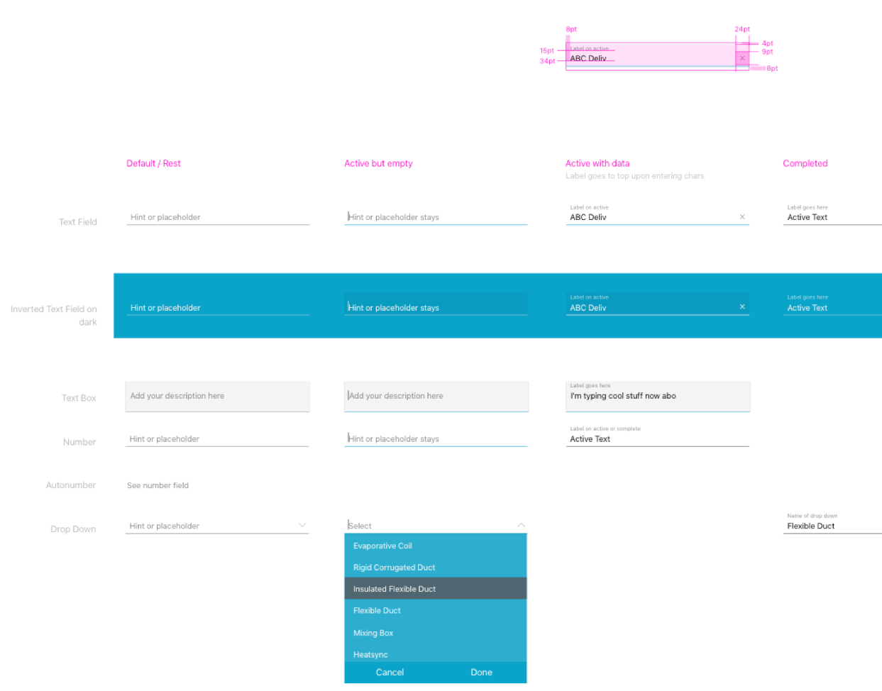
While we had a core styleguide in place it was built when our app was built using an older codebase. The styleguide requried drastic updates throughout so that it could be scaled and leveraged across any future products myself or other designers would create.
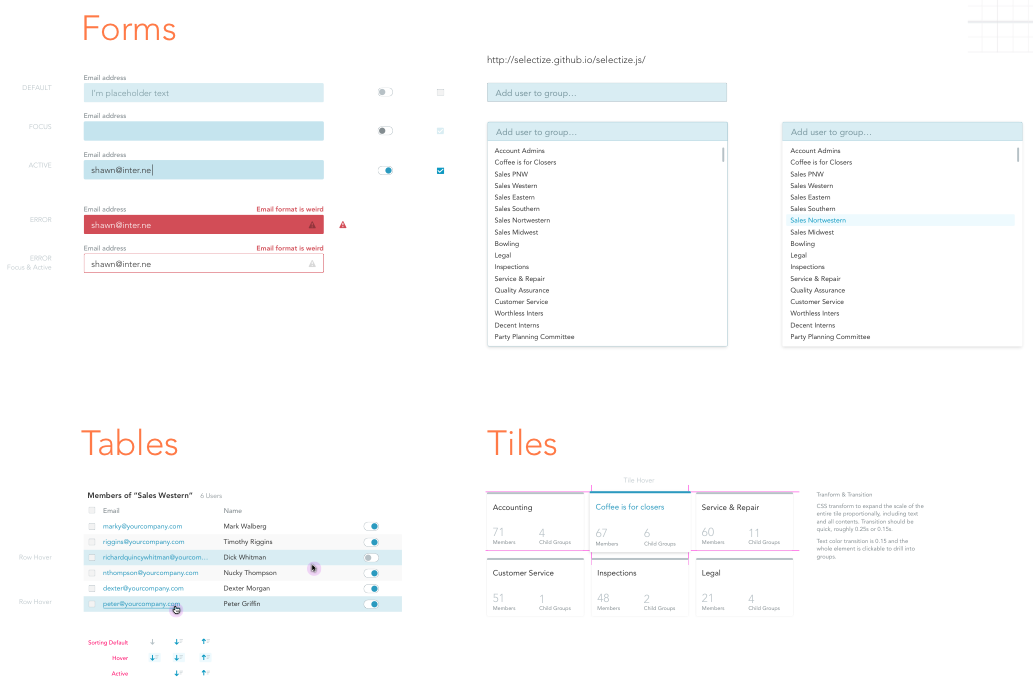
Applying our design system to iOS and Android
Android's Material Design and iOS' Human Interface have pre-designed and pre-coded components that developers could easily leverage to build a decent UX. However, these systems are flexible so it was important to modify interactions and UI to create consistency throughout our platform.
Scaling the new design system to new products for SMB and Enterprise customers
Now that we had a solidified design system in place it was time to start building out new products for our customers.
Products outlined below:
- Public Forms - Share your forms with anyone outside your accounts
- Android app - Better onboarding and new components
- Reporting tool - Report on your form data and export it to your favorite apps
- Connected Applications - Connect your data to other business systems
Getting to know our customers
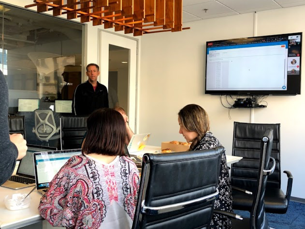
User research was quintessential. Making sure the user had a seamless end to end workflow across all of the products and platforms was vital. I did user interviews with both SMB and Enterprise customers. For the SMB base we identified local customers here in San Diego and went onsite to host user interviews and product walkthroughs. Below is some of the qualitative data we collected.

"This product is perfect for my business but when I enter the empty state I have no idea what I’m supposed to do without the guidance of my Account Manager. Some more direction or a guide would help immensely"

"I was able to setup my Public Share but I had no idea it had sophisticated features behind it like being able to set an expiration date and being able to control which form fields are displayed to the user without having to completely rewrite my current form"

"It’s nice being able to send out these forms but I have no way to report on this data without meticulously reviewing each form manually tallying data in a program like Microsoft Excel"
Analyzing the beta product
The first step was to tear apart the old design and build a new user flow that made more sense. Previously the user would be created with nothing but an empy modal and a brief sentence describing the functionality. The primary cta placement made no sense.
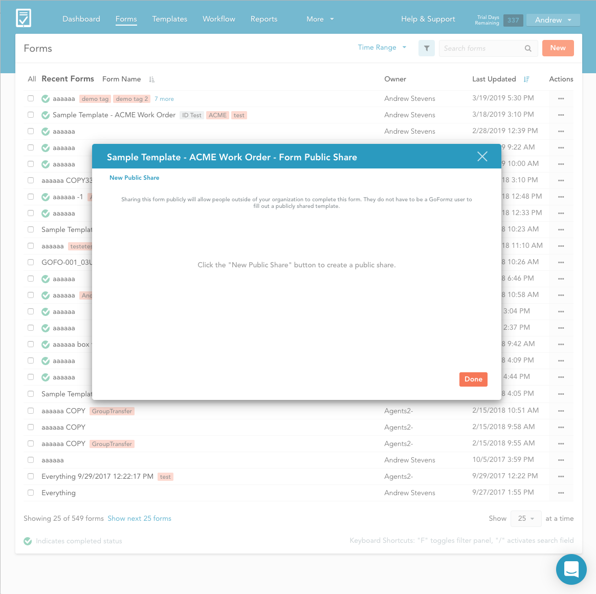
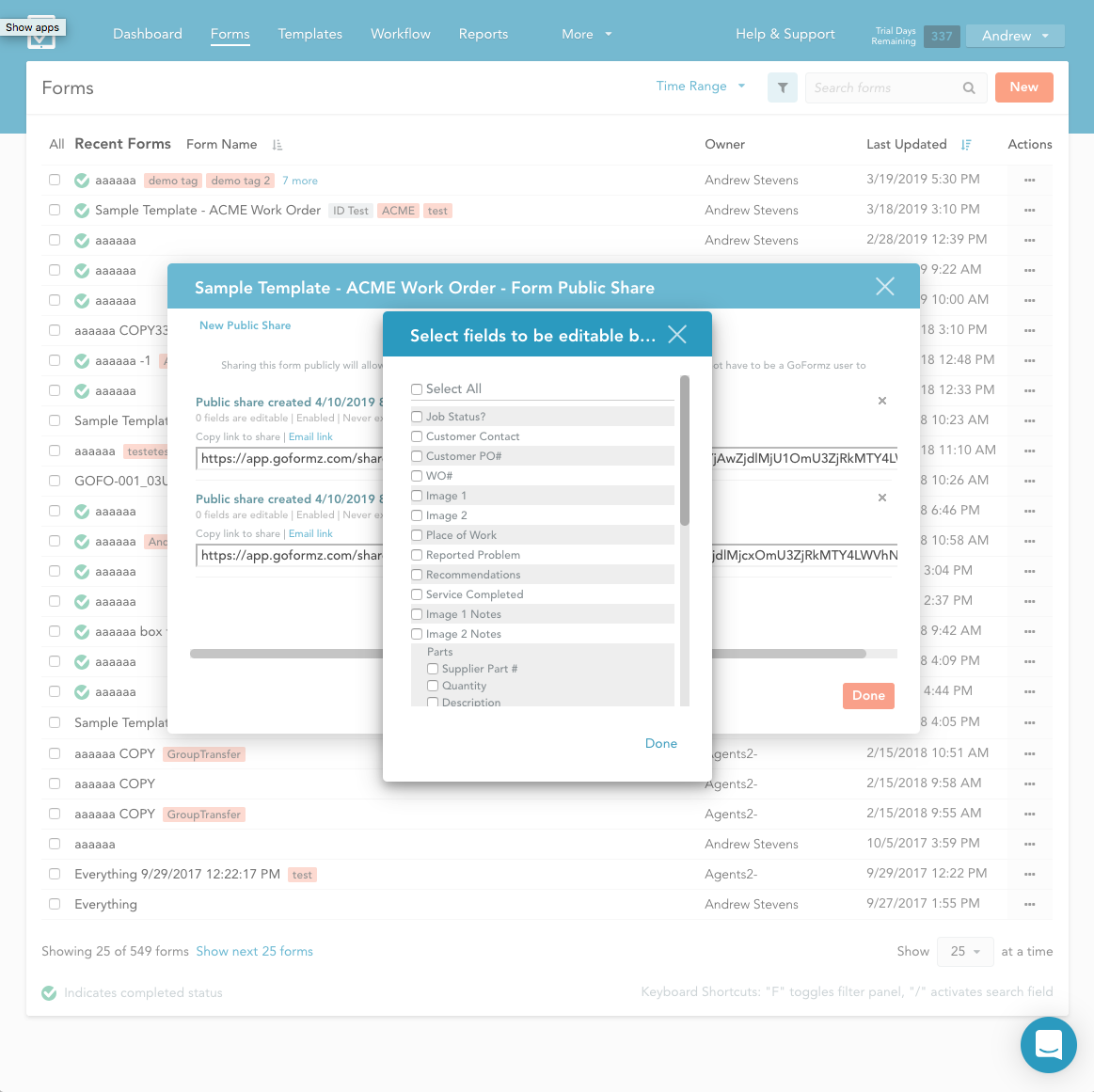
I assembled a panel of customers currently using the beta product. After a few user walk throughs the success rate of finding and creating the public share took over 10 seconds. Assuming the user was able to figure out where to start they then proceeded into modal hell. Selecting the fields you want to share with the customer and selecting an experiation date for the public form was disasterous.
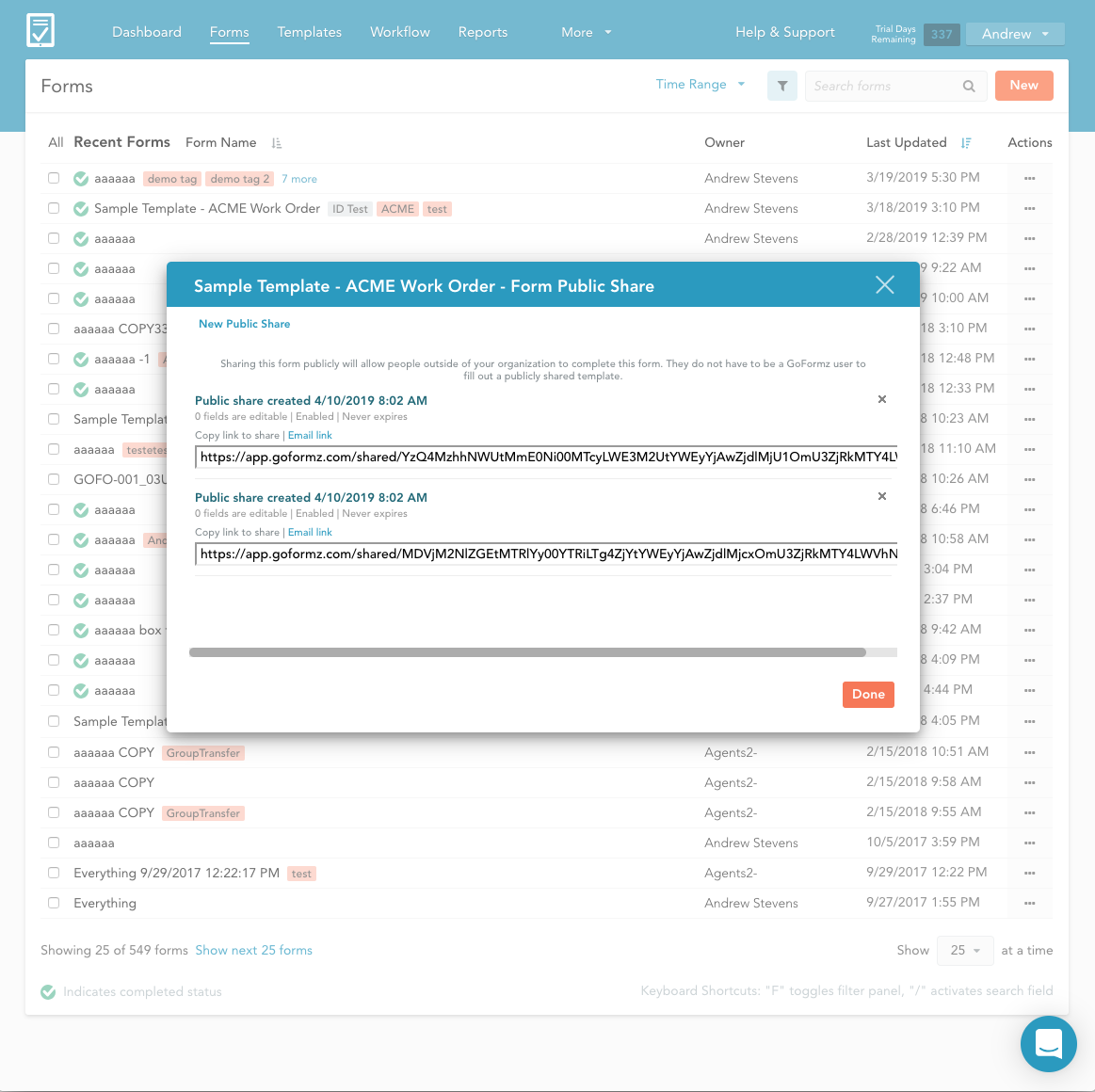
The final step of sending and sharing a public form may have been the most confusing. Instead of a dashboard all of your public shares were collected as a list in the modal below.
Task analysis, conceptualization and new workflows
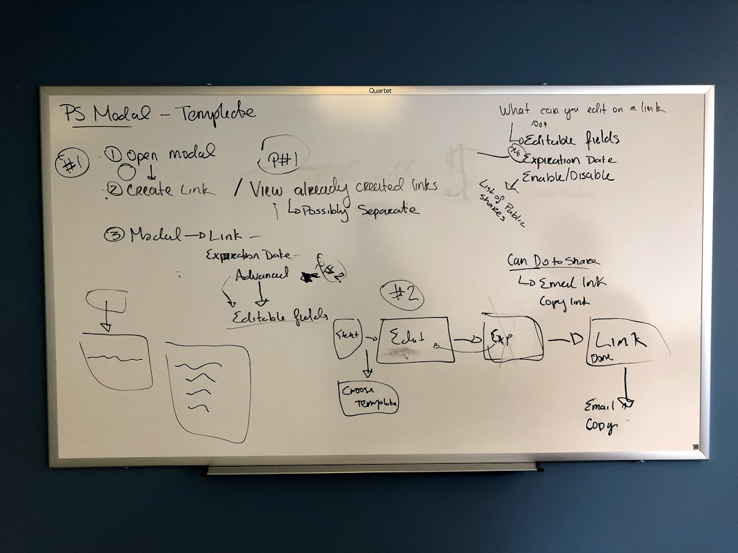
I started whiteboarding and wireframing the information architecture for new use cases. We had the exciting opportunity of deviating a bit from the company styleguide. The reason for this affordance was that our founder was refactoring the entire webapp from node.js to react. While I was excited to create new symbols and components I faced challenges stemming from respecting the current styleguide while creating new more modern pieces that fit withing our existing style framework.
Before moving on to high-fidelity comps I created two interaction models. One was an MVP, what I know we can build within an accurate timeline with the correctly pointed stories. The other is a nice-to-have. Allowing engineers to pull-in side features when and if they have time. This helped avoid feature creep towards the end of the epic.
Once the beta product was in place we executed task analysis and user testing. We kept the user journey and task analysis pretty simple. Create a public share, fill out the form on your device, then create a basic report. I observed the sales team execute the tasks individually. Our jr. account managers had really good feedback regarding what we can do to optimize this product for their SMB customers. The account executives had a different approach. Instead of feature feedback their feedback was on what they could upsell and what we would need to add to make it an Enterprise feature.
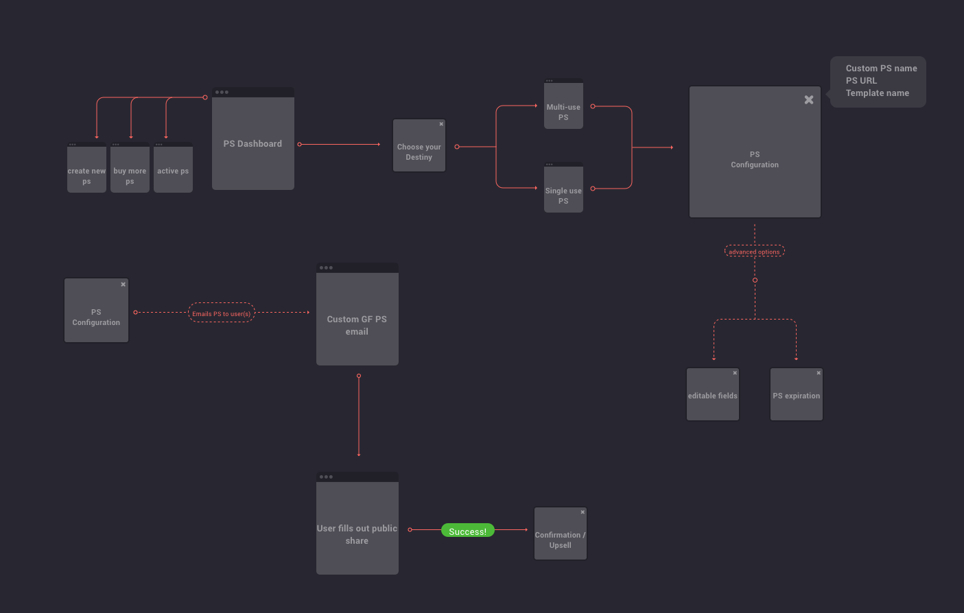
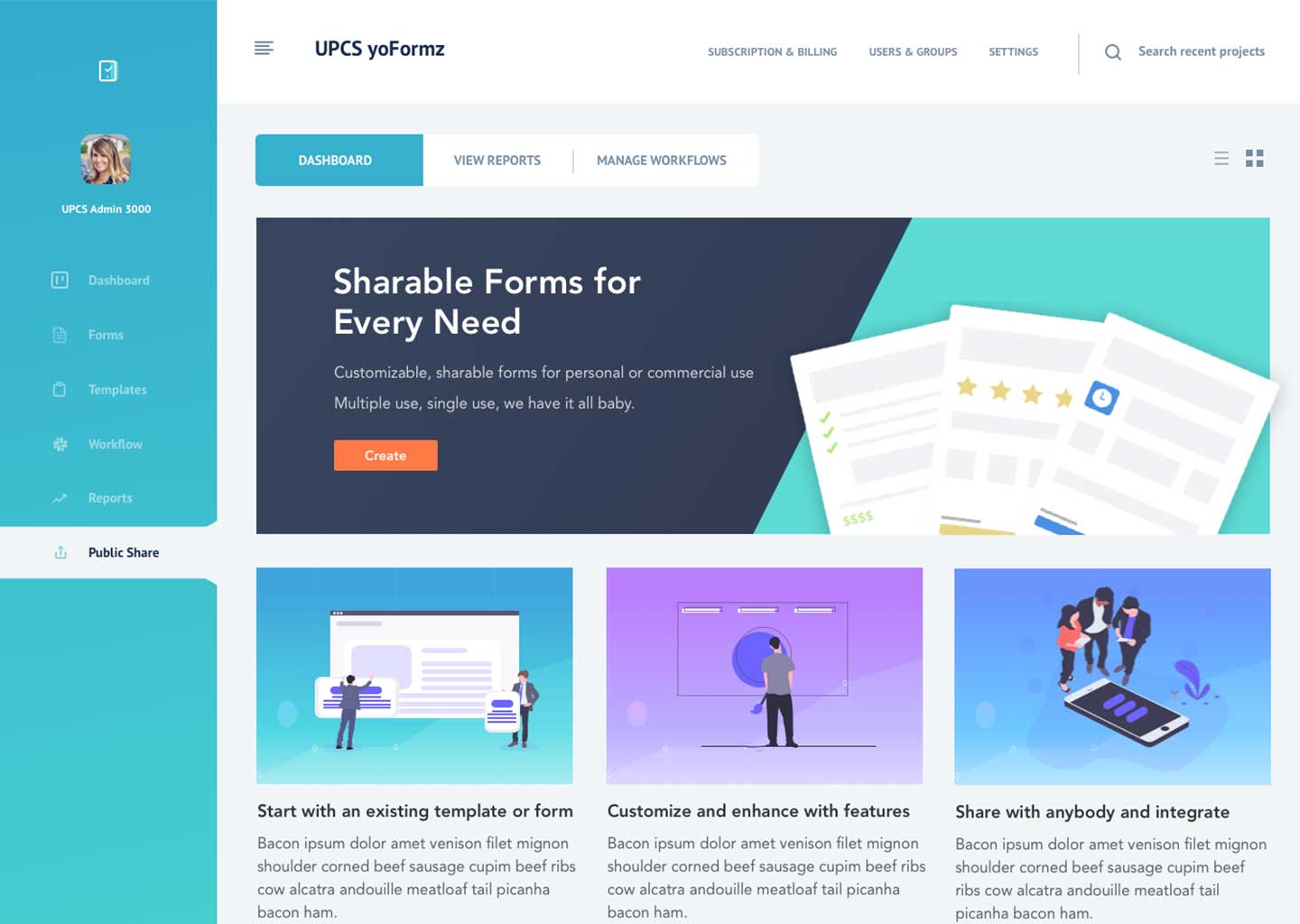
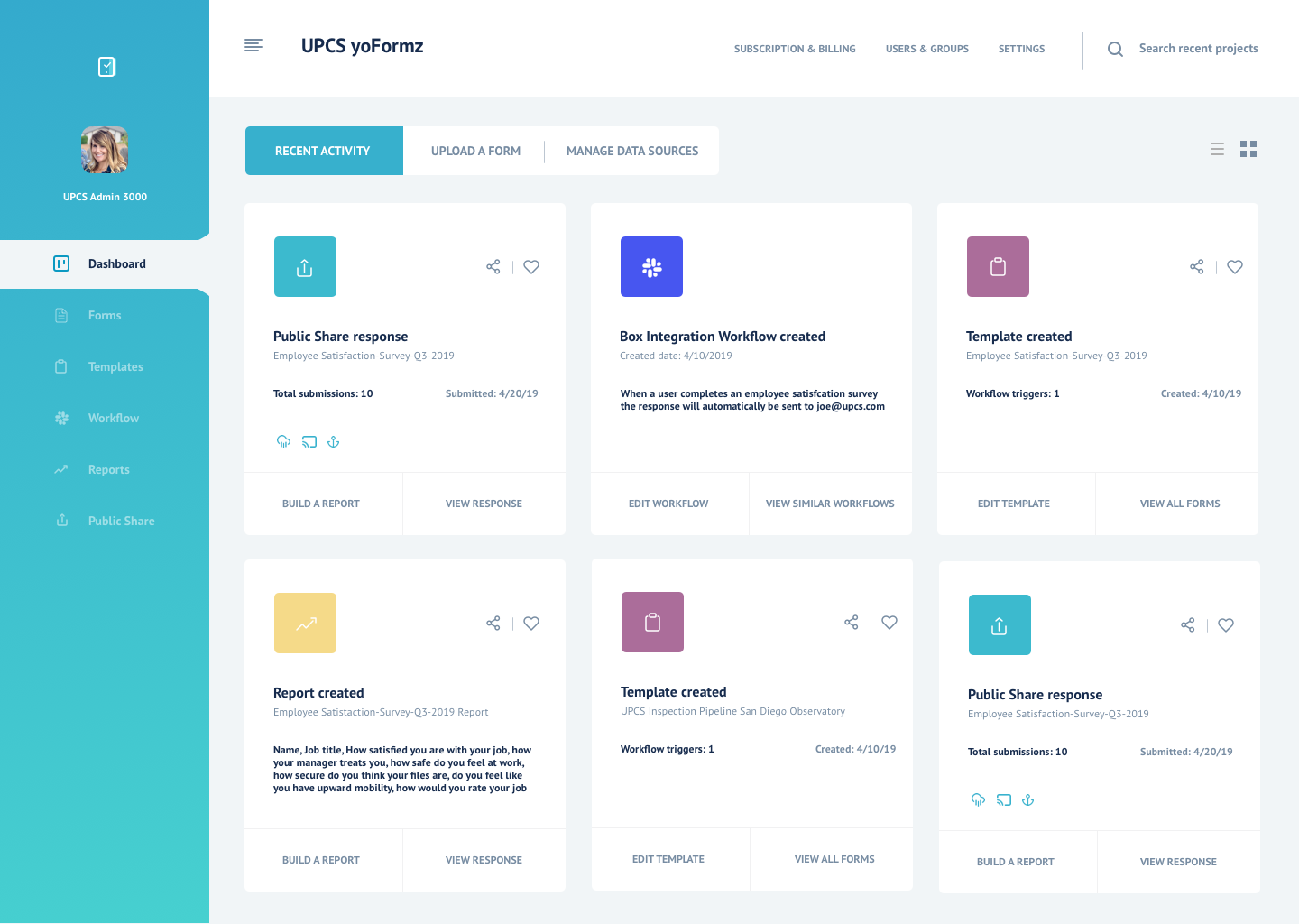
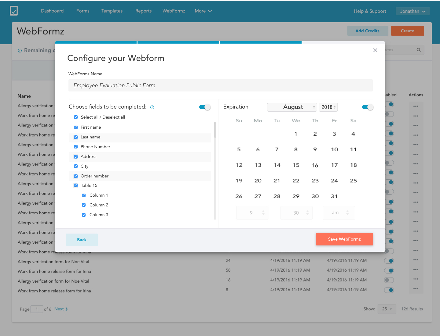
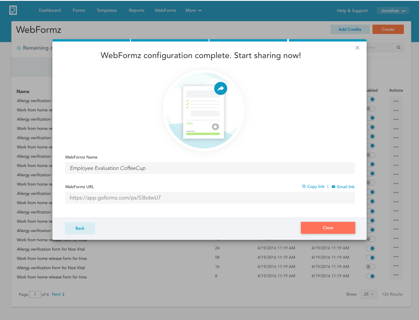
The solution: one place for all of your digital forms
A new dashboard would be the central hub of Public Forms. Here a user can see how many submissions they have left, buy new submissions, view all of their active Public Forms and create new Public Forms.
An enhanced workflow
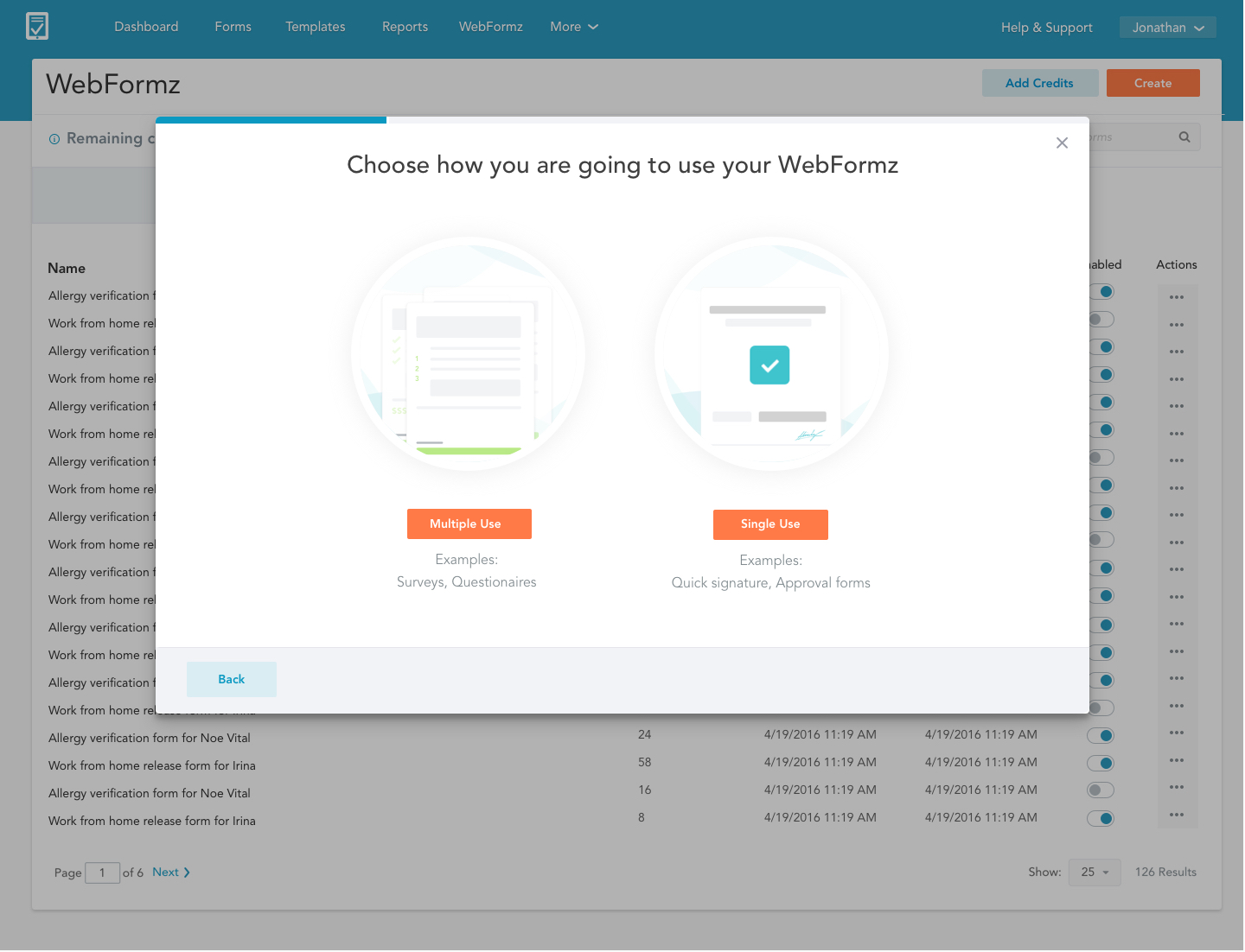
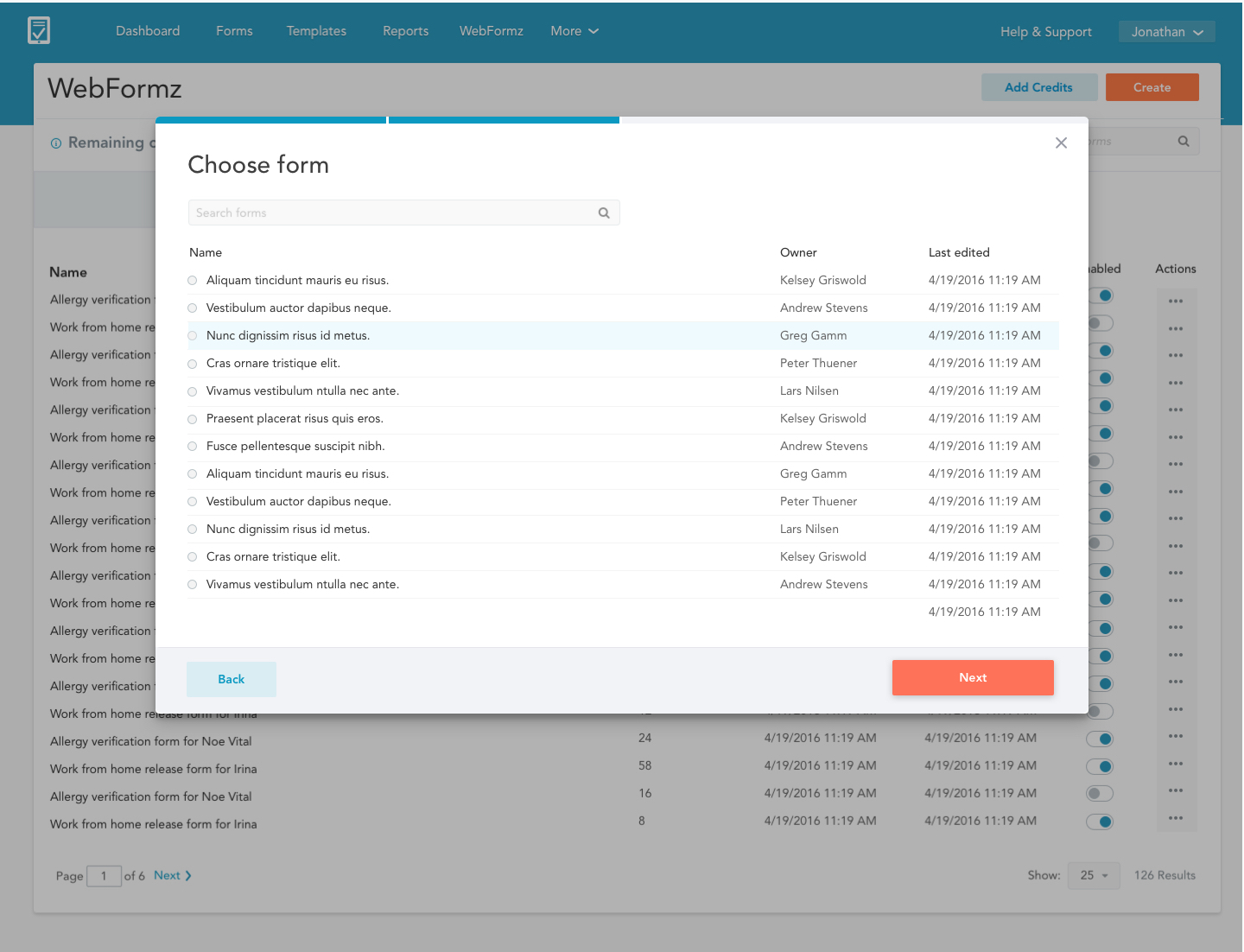
Instead of modals layered on top of modals we decided to go with a wizard. Since this is new product we decided to go with the simpliest, most familiar UX to maximize adoption rate.
We would maxize adoption rate by appleaing to SMB customers. Keep setup simple, then hook them in with reporting and integrations later.
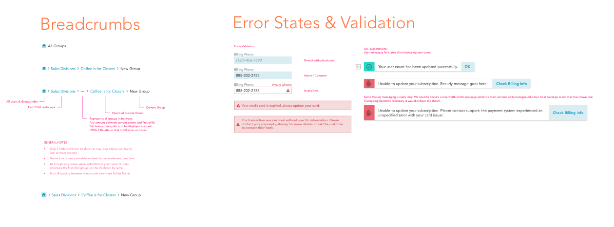
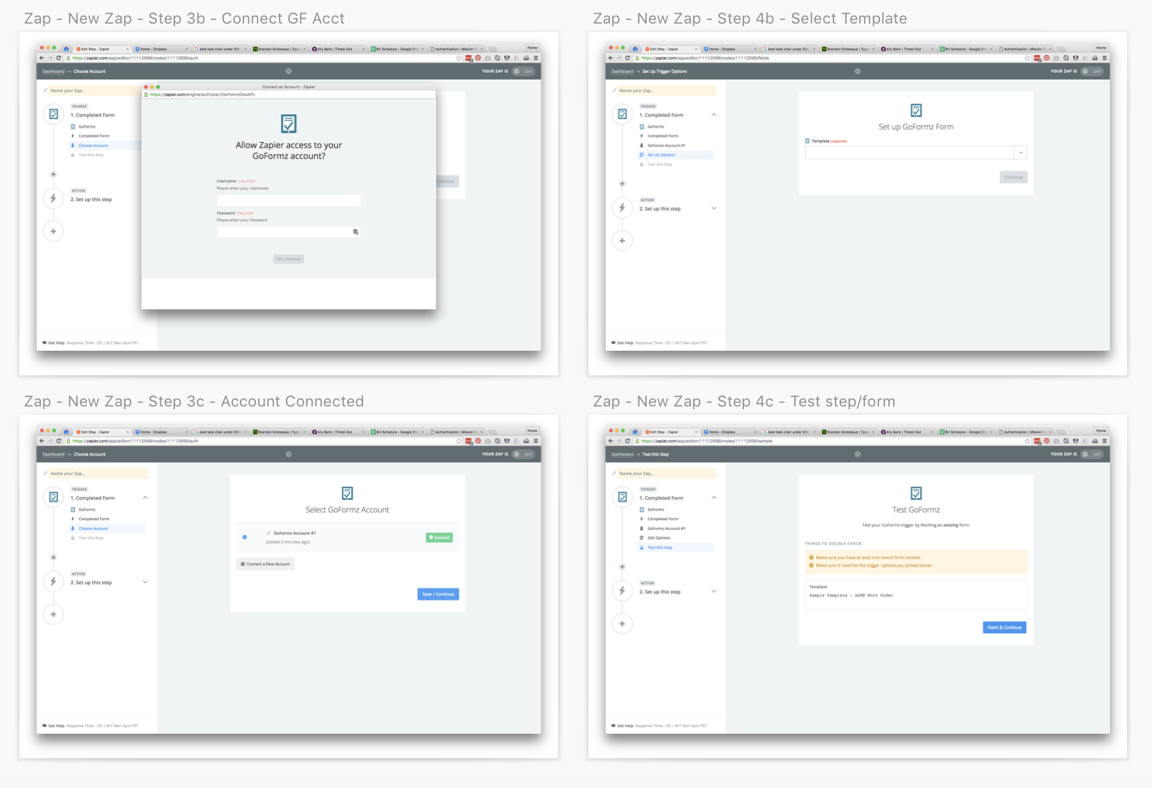
Several new components were created for this product. Including react-based toggles, tables, and date and time selection, and new graphics that steer away from our dated icon set. We also redesigned our standard modal from the ground up utilizing more modern design patterns and a clean 8-pixel grid. To keep the user informed of their step in the process we created a step indicator within the model that will be used across the rest of our web app.
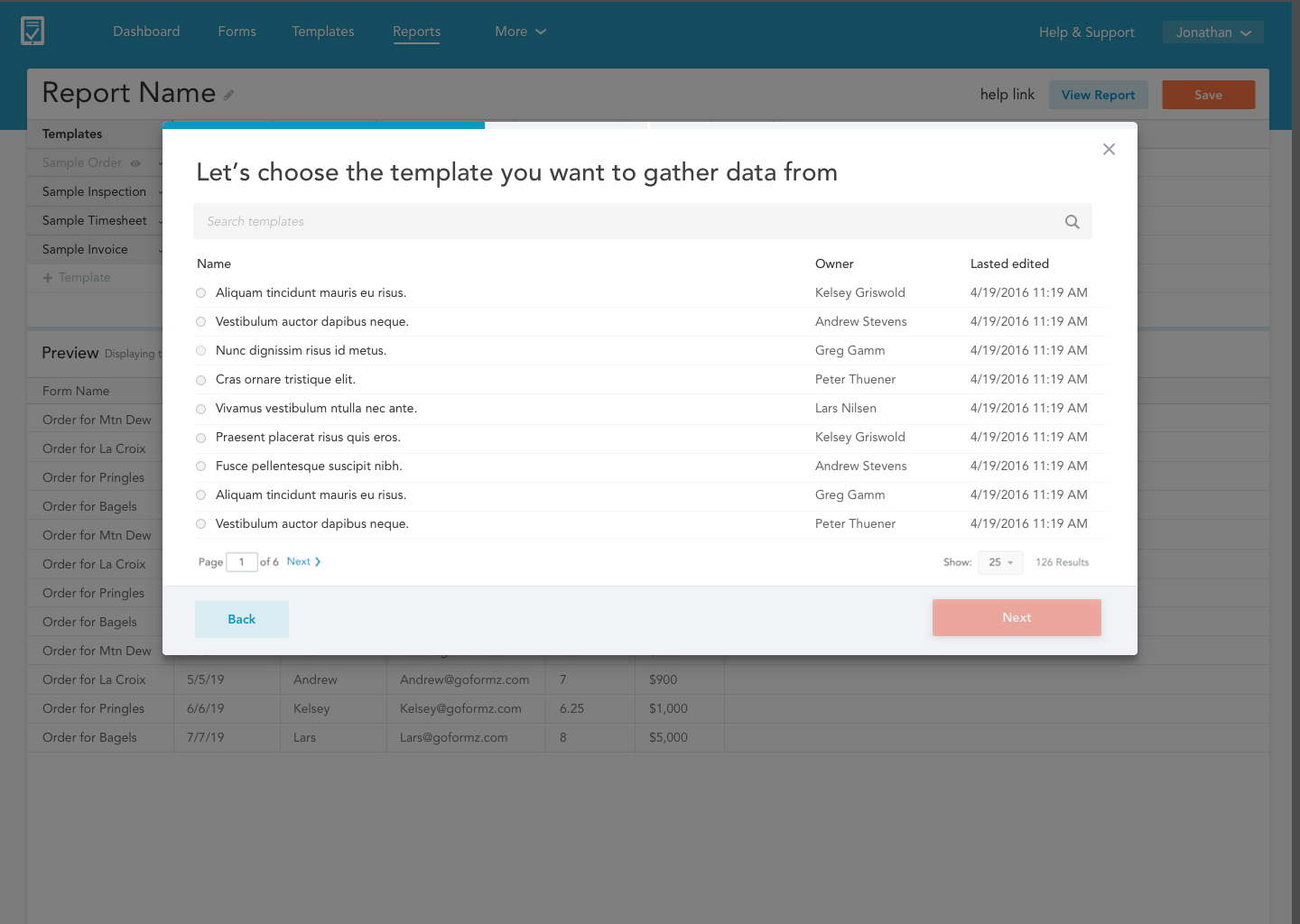
Creating a Public Form
- Create a new public share from a template or a form.
- Give the public share a unique name.
- Define shared fields and set an expiration date.
- Copy or email the form to the desired audience.
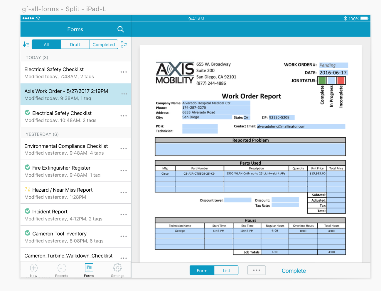
Filling out your forms on a mobile device
The GoFormz Mobile Forms app for Android and iOS lets you fill out and manage your forms on any Android device. This includes the following functionality:
- Create new forms from a template and fill them out on or offline
- Manage existing forms, including editing, deleting, tagging, etc.
- Transfer forms to other users and receive dispatched forms
Solving painpoints prior to release
The Android app was not in production when I joined GoFormz. There were several workflow and features that needed to be worked through.
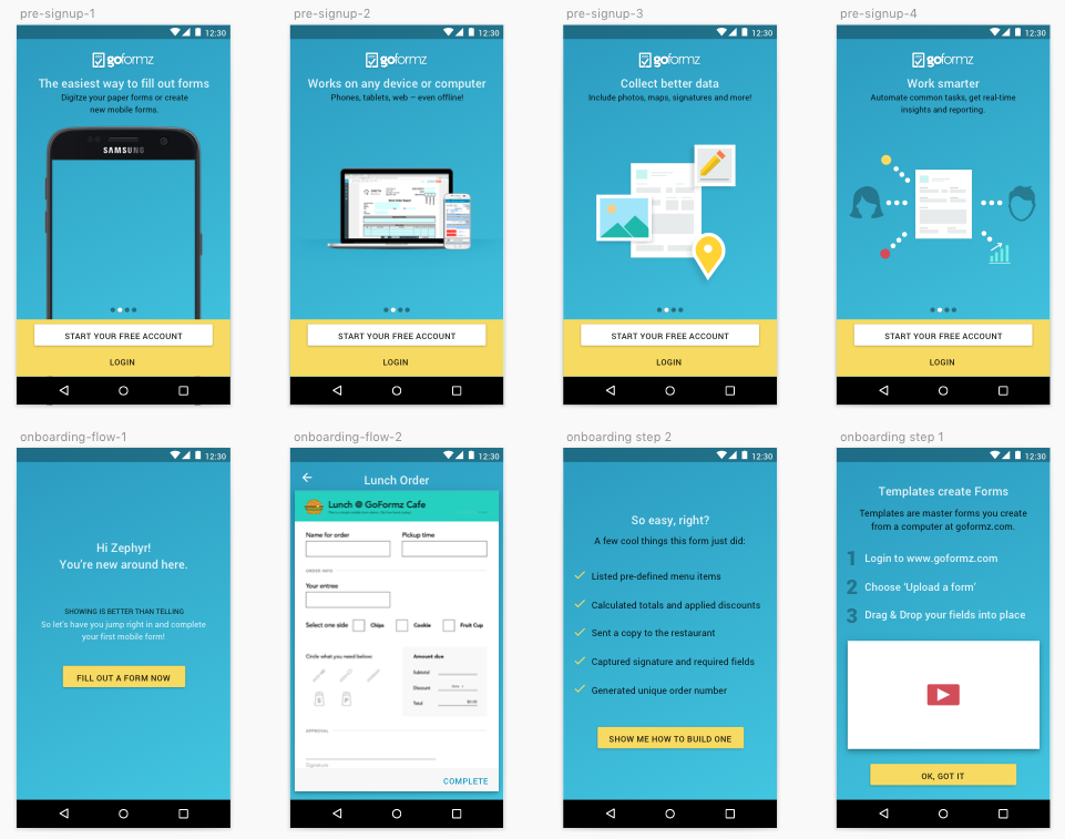
Better onboarding for new users
Previously you encountered an empty state with no information and no prompts as to what to do next. If a user were to download the application without any existing knowledge of the web app they would be dead in the water. We rewrote the onboarding process and created a mock template that the user could fill out to demonstrate the capabilities of the full-platform application.
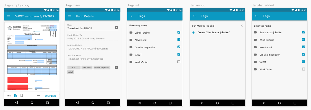
Tagging a form and sharing it with the main office
A powerful feature that users in the field can leverage is tagging. Once a user tags a form, the office manager can easily surface any relevent tags to create future reports. For example, let's say there's a subcontractor who surveys and inspects several job sites in a day but they all share the same base form template. The subcontractor can easily tag each form he completes so it can be referenced at a later date.
The tagging we used in iOS and our Webapp would scale nicely into Android and Material Design. I leveraged experiences from Google Keep to create an intuative, native experience.
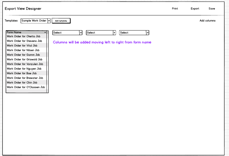
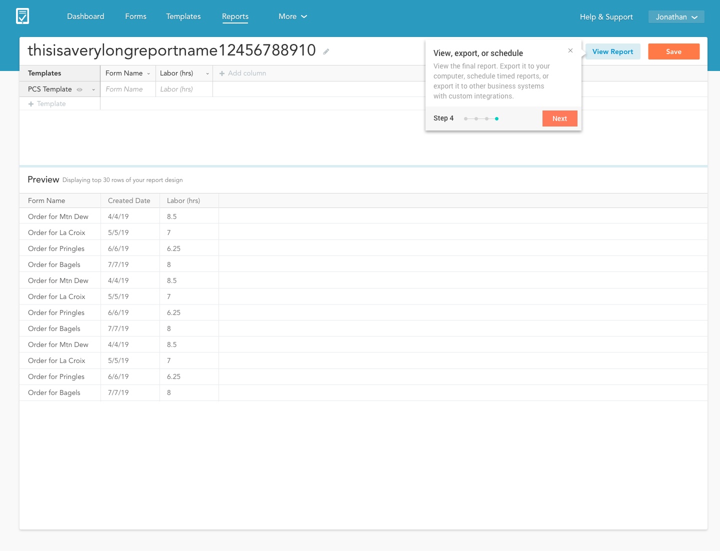
Reporting on your form data
After the user receives responses on their forms that can start tabulating the data with our reporting tool.
For instance, the elementry school teacher could quickly create a report to quickly find:
- The ideal day for the field trip based on their availability
- How many parents were able to voulenteer to help
- Get a quick count on how many signatures were gathered
The problem is that Microsoft was sunsetting services that were tied to the old reporting tool. It provided a great opportunity to rebuild the reporting tool while we were at it.
Tearing down the old product (round2)
The existing reporting tool employed a drag-and-drop, windows-style UI. Additionally the UX was disorganized. For example, let's say you are an office manager and want to figure out how many hours employees spend on inspection job 1 and inspection job 2. You can report across multiple form types to find common form fields, but it was impossible to discover these powerful features.
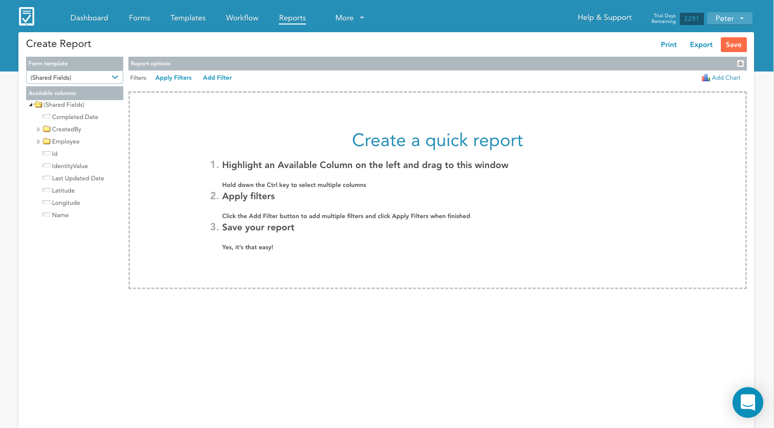
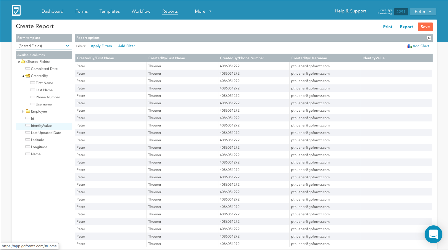
A more complex product but let's keep it simple
Since reporting tools are pretty complex I went through several dozen rounds of whiteboarding and wireframming sessions with the product manager. I also collected a ton of feedback from the account management team who were typically called upont to build reports for customers.
While our reporting product is far more complex than public share I wanted to unite the experience and continue appleaing to the SMB customer but layering in high-powered enterprise features as you become acclimated to the product. We would continue to follow the self-guided pattern since it was proving to be successful in accounts that were given beta access public share.
A familiar pattern with nifty new features
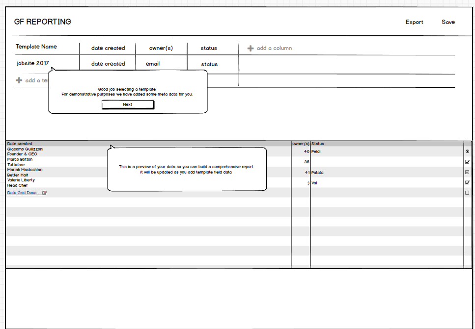
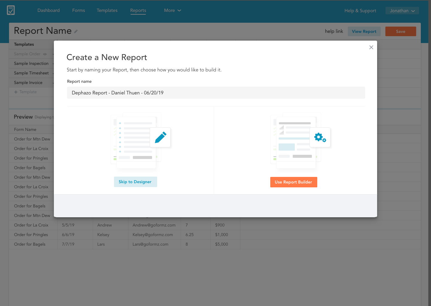
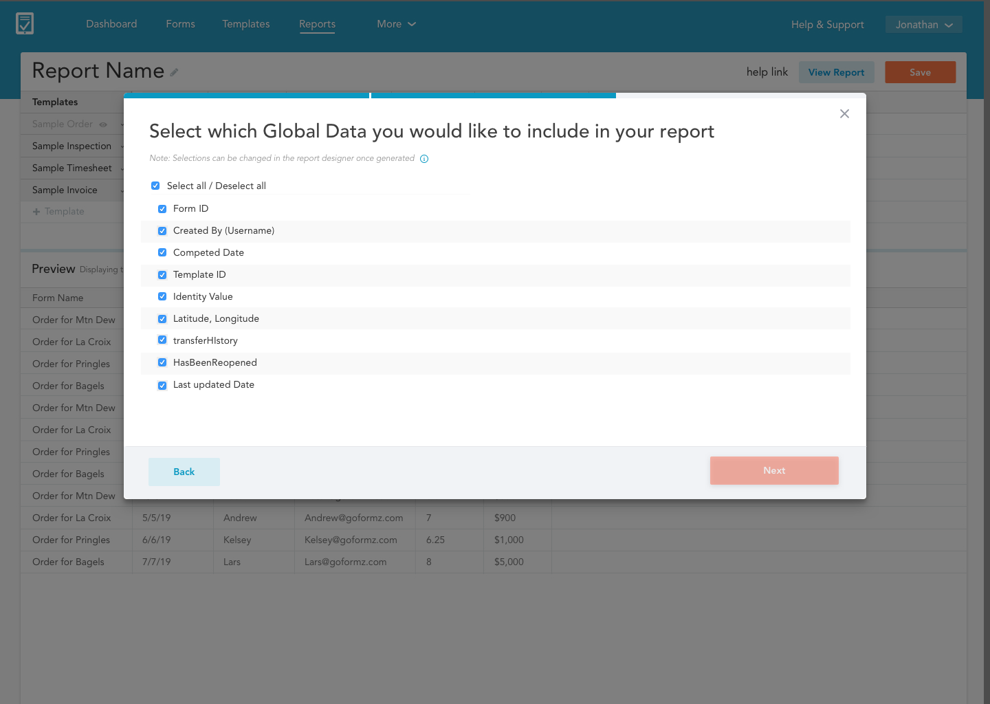
I took the guessing game out of a fussy drag-and-drop UI. The user can now choose a guided path or just jumping into a new inutive interface. We decided to make sure the user had a basic report to work off of by adding the option to include data fields that all forms have such as created date, form name, and template name.
Once the report was created tool tips were added to familiarize the user with the new UI and clue them into what they could do after they finished a report. We wanted to get out of the data analysis business. The objective here was to allow the users to create a report, but then export it to Box then work on it in a system like Excel.
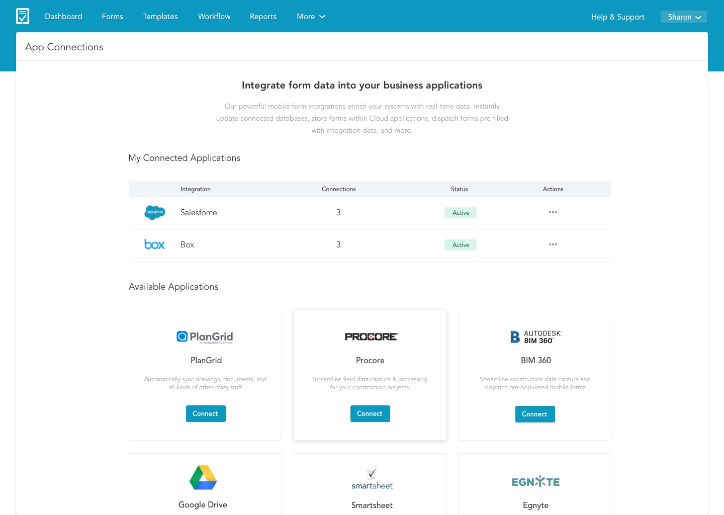
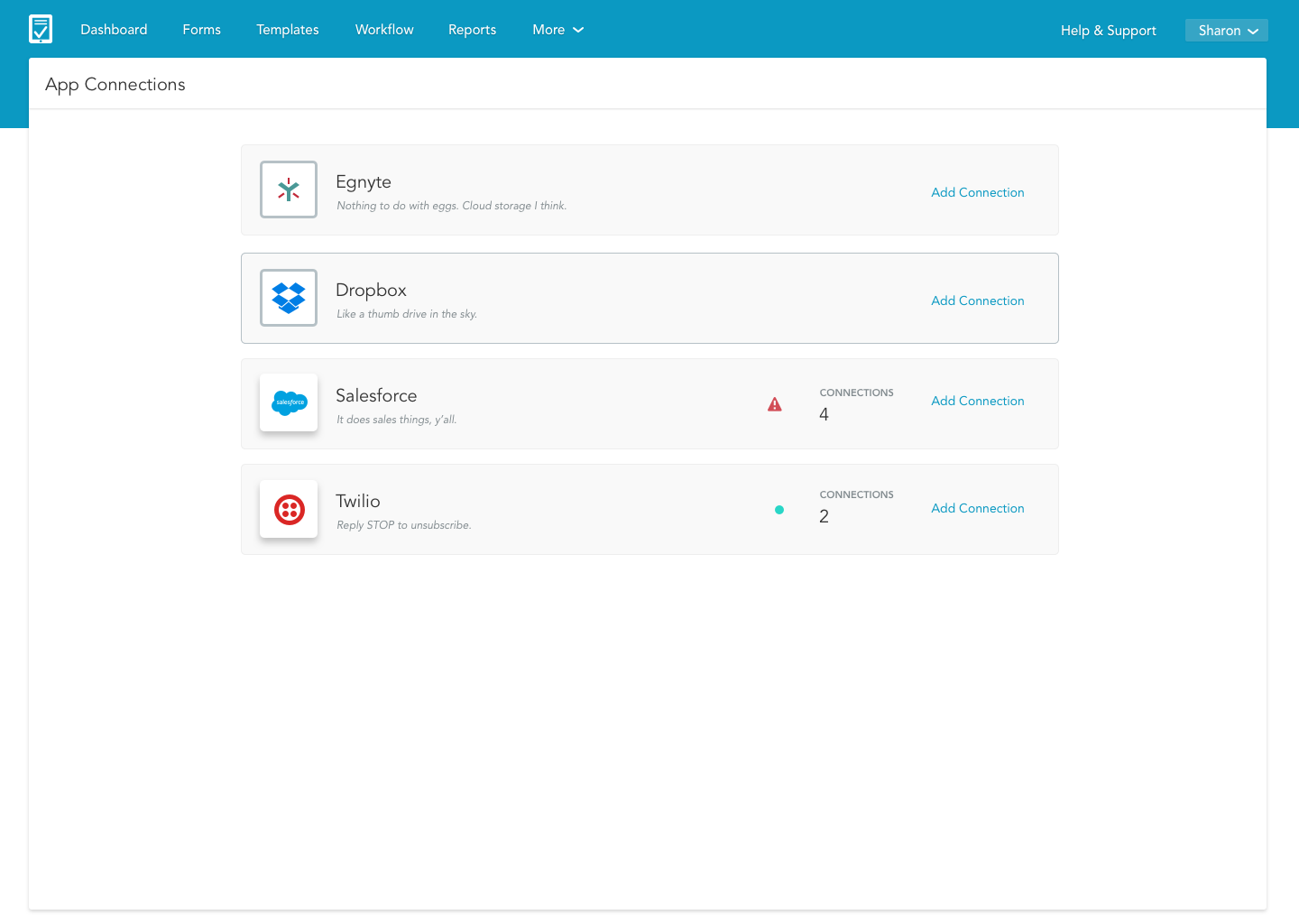
Connecting your form data to your other business systems
I sat next to a customer that asked how they can connect their account to Box. The walk though was frustrating to the user. Once they finally found the connected apps screen they didn't know what to do when they landed there. It was just a list of apps we have with no clear descriptions of how that application be integrated with their GoFormz account.
Assessing the landscape and creating wireframes
Though this product is fairly straight forward it was important to get the wireframes right. I wanted Connected Apps to follow similar patterns across other companies. Identify the problem, locate the appropriate appication to address this problem, and quickly setup an integration to fix the problem.
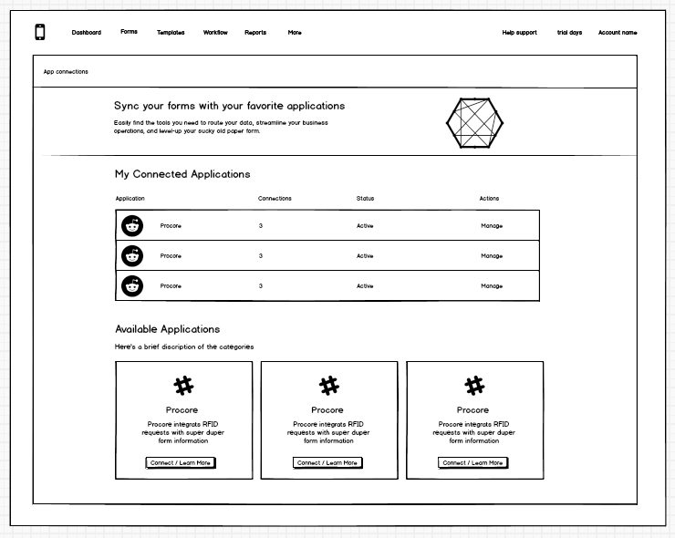
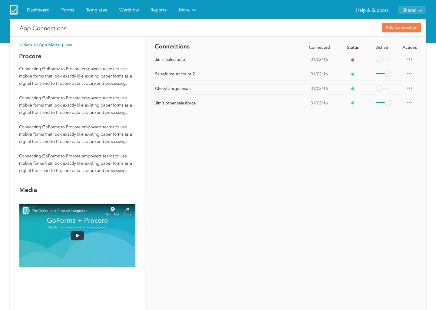
The solution: An easy-to-use app marketplace
Not just a list of applications with vauge descriptions. We now have a full marketplace with detailed pages that give the user the ability to discover and manage their integrations.
A cleaner more accessible interface
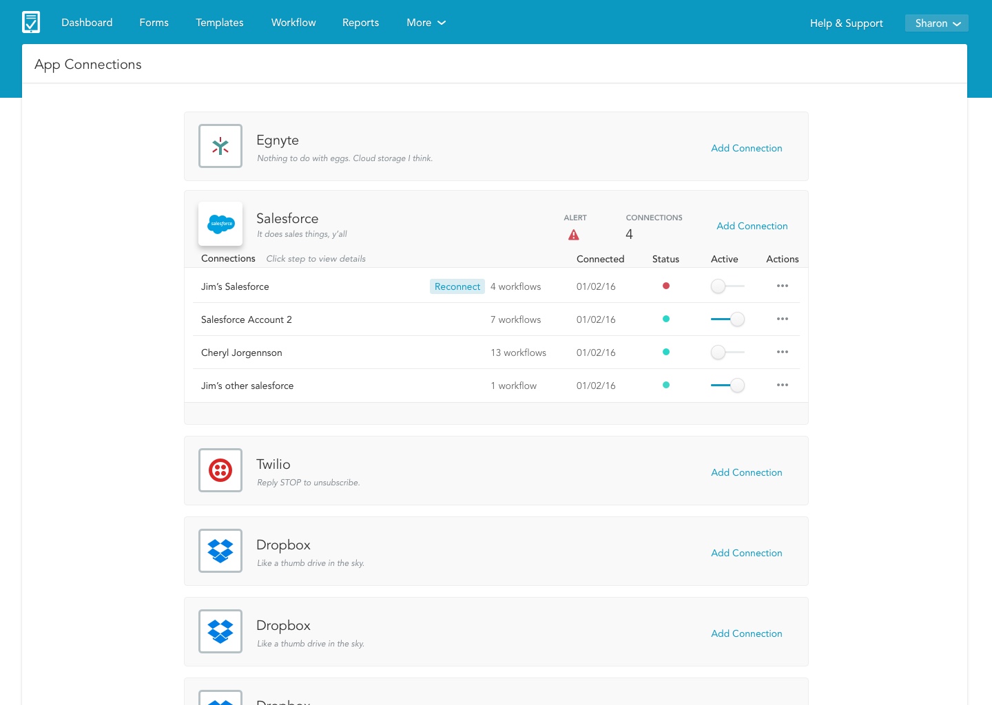
We added a brief description of what connected apps can do for your business. It was then important for the users to see and edit existing connections. Below existing connections we added a grid of available applications.
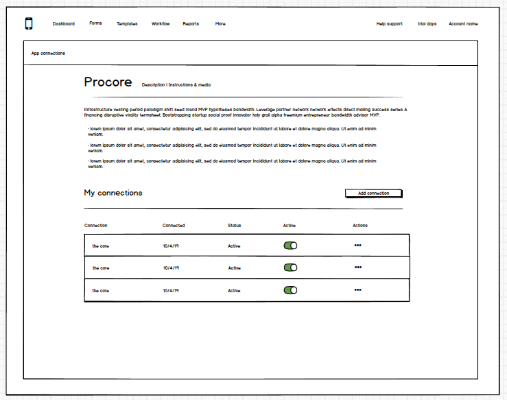
In the detail screen users have access to content marketing where they can first learn more about the integration if they want to add it. They can also see all existing workflows for that integration.
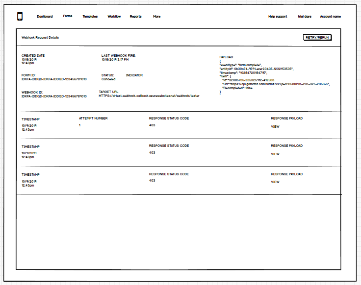
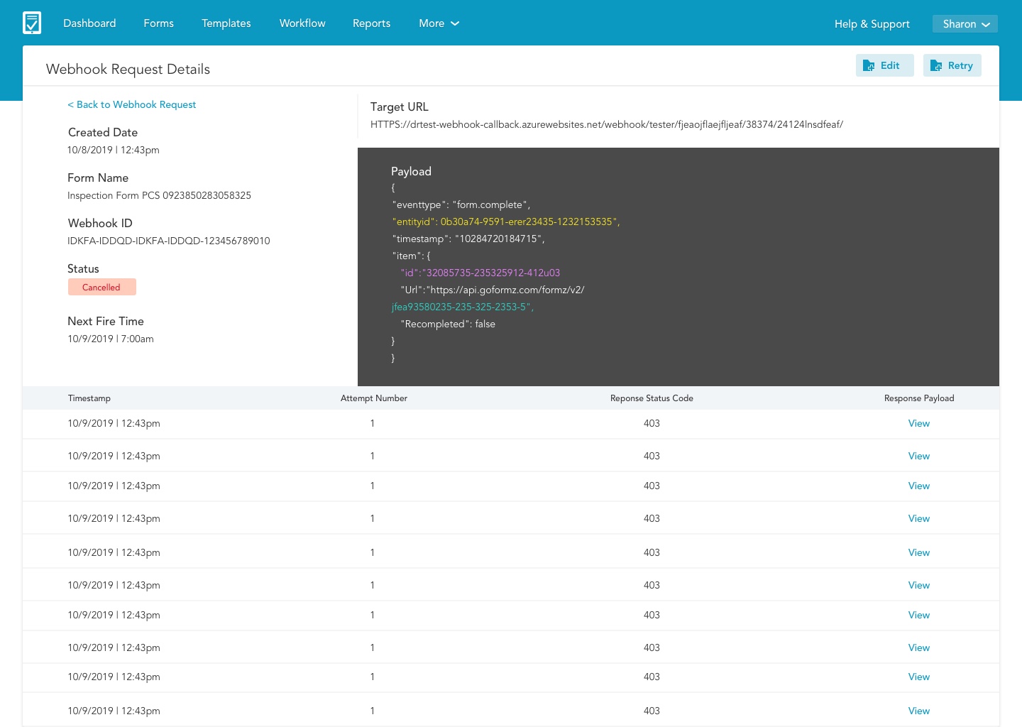
Webhooks and APIs
After the integration is setup it was crucial that a developer could locate and fix the webhook if it misfired.
The Webhook UI needed to have the following:
- Metadata
- Number of attempted connections, when they succeed and when they fail
- The ability to see the targeted URL the failed payload.
Measuring Success
These products are pivotal to growing GoFormz bottom line. It was challenging yet rewarding to create products that would appeal to both the new user and the power user. Once these products were released into product we saw large adoption rates for new customers and enterprise users were quickly expanding their license type and account to gain access to the new products.
+40%
Growth in Enterprise Licenses
92%
Form completion rate
30%
More mobile users with intro of Android
100%
Reduced load-time with new UI / code refactor
Project Learnings
Simplicity is strength
As a designer, we are often lured by attractive, trendy and out of the box designs. But, We must always remember the ‘why’. The primary goal is to understand the user, their problems and then come up with a design that solves it. Wizards may be so 1995 but for most people they are familiar adoptable pattern.
Prioritize
Create a strategic plan to launch an MVP. This helps deal with out-of-scope requests that could potentially derail the project and helps deliver a quality product in time.
Seek out feedback early and continually
Keeping the stakeholders/users in loop and testing solutions in whatever form (paper, low-fi or hi-fi) as early as possible saves ample amount of time and re-work.
User Profiles
The research made it evident how different users would use the Public Forms differently. To cater to this, I categorized them into profiles, (SMB and Enterprise) based on their goals and tasks.
Elementary School Teacher
Highly involved with community | Bakesale fundraising champion | Bachelor’s in Childhood Development & Psychology |
Uses google forms and google sheets
Tasks
Admin at Scripps Health
Familiar with SaaS systems | In their 40’s | 15 years of office management experience | A.A. in Business
Uses box, quickbooks, google calendar, gusto
Tasks