Overview
MTB Hero is an app that allows users to find and demo bikes near them. The app would be best leveraged by enthusiasts traveling to exotic bike destinations such as Whistler, Moab, or Sedona. Instead of Googling and calling local bike shops, users can pull up the app and find rentable hardware wherever they are. This idea would scale nicely into the sharable economy model but for now I want to keep it to bikeshops so they can demo their unused fleet.
My Role
Senior Product Designer
User Research, Wireframing, Interaction Design, UI Design
The Problem
There is no streamlined way to demo a bike. It's a pretty niche activity for users to engage in but the workflow is pretty standard. It should be simple but it's not. Instead it takes users 25+ minutes to locate a bikeshop, select a bike, schedule it, and pay for it. How long does it take us to browse and order takeout on postmates? Or even lock down a place to stay on Hotel tonight?
Surveying the landscape
I myself have tons of frustraitons demoing bikes. I travel to NorCal from SoCal often and it's a pain to Google or call bikeshops in the town I'm traveling to. Once I find a shop that demos bikes I either have to call to find out what bikes they have available, tell them when I want to demo it, and give my credit card info over the phone. IT'S 2019!
I wanted to make sure that other riders were having similar frustrations to make sure this app was worth designing. I frequent Reddit MTB and figured that would good be a decent place to start outside of my current network. I created a simple 6 question survey and actually received a good amount of data. The survey can be viewed here.
Survey results and product viability
The data collected validated my hyphothesis. Users are indeed interested in using the app and they appear to be tech savvy. This data suggests that users would be quite open to using an app such as MTB Hero but the UI would have to be seamless and as low friction as possible to ensure solid adoption rates.
55%
Would demo a high end bike
90%
Would use MTB Hero
62%
Found scheduling and payment as hard as finding a bikeshop
30%
Of participants make $120k+
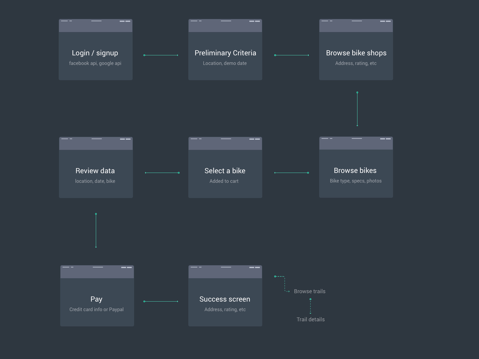
Defining the workflow
MTB Dad is a leisure biking enthusiast traveling to Whistler. He decided to book a bike for a weekend trip with his friends. He used MTB Hero to locate the best bike shop in the region, procure the bike he wanted, and decided to use paypal to reserve the bike.
I found that MTB Dad's journey could be achieved in a few easy steps:
- Login & Signup
- Define where to demo the bike from
- Schedule a time and date to demo the bike
- Browse and select a bike
- Easily pay for the bike
- Browse popular trails near the location of pick up or in a defined area
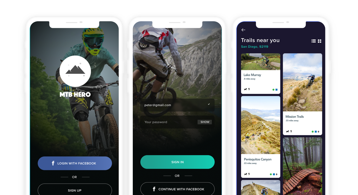
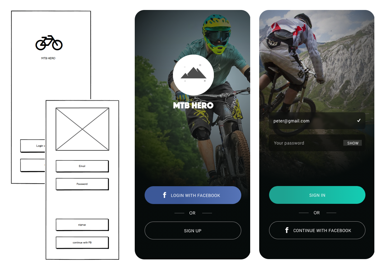
Signup
Simple sign up - facebook api or email with password.
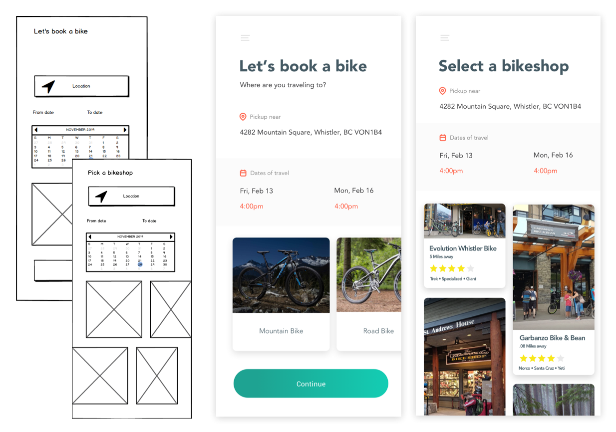
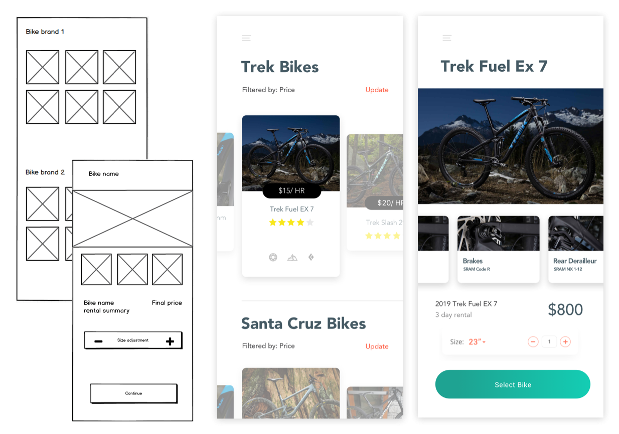
Preliminary criteria and browsing bikeshops
Survey data suggested that scheduling a bike and paying for the bike are the two hardest steps. I wanted to bring a lot of focus into the ease of locating a bike shop and scheduling a pick up. I followed similar patterns found in other popular booking apps.
While a list makes sense here I chose to go with an image-driven grid layout. When you're traveling to new destinations it's cool to see what type of experience premium bikeshops offer. I know when Im looking at demo bikes I care about the customer experience and the visual appeal of the shop since it tends to drive a post shopping experience after bike drop off.
Browsing available bikes and selecting a bike
As a user not familiar with every brand and every bike type I thought it was important that bike brands and images were at the forefront. The user could then filter down by price or bike type, travel, components, etc.
A user would select a bike by hitting the tile. Once in the detail view they could browse all the components, see if their size is available, and also a preview of the price of the bike for the date range they selected.
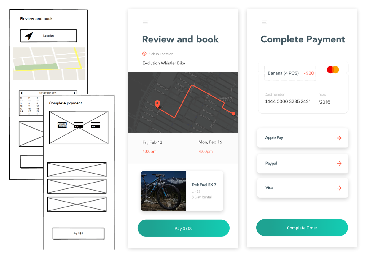
Review and pay
Vital steps for the bottom of the funnel. Reviewing your order and placing payment. I wanted this to be as low friction as possible so I kept the elements very light and kept all interactive actions to a minimum. Users had mentioned that paying for the demo was the highest point of frustration so integrating Apple Pay data directly from their phone while also leveraging other often used payment methods kept things tidy.
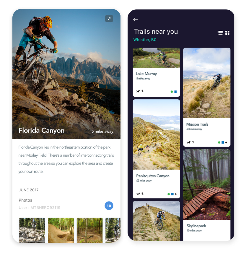
Incorporating user-driven content and integrations
A bonus portion would be having integrations with Trailforks or Strava to display user-driven content. This could be a sticky component to the app or a separate feature where users can share photos and their experiences.
Final thoughts
Qualitative data is huge
As a mountain biker myself I have my own thoughts and reservations about the end to end experience of demoing a bike. I discuss it at length with my friends whenever we book a trip to ride. It was validating and insightful to know that the audiance we sampled had similar frustrations.
Quick execution
This is a passion project. I specfically constructed it for an interview. I wanted to see what I could design and build in a very short timeline. I designed every part of the app and built it in just 2 days. My experience is in saas and conversion optimization. I wanted to showcase a project that would give me free reign over UX and UI without having to adhere to design systems or predetermined styles. Since the project was rushed it doesn't fully demonstrate my best capabilities. I'll probably revisit this in the future to polish every aspect.
User profile
Based on the data above I defined the target user as a middle-aged affluent male.
Mountain Biking Dad
35 years old | Rides 3 days per week | Takes MTB trips 6 times per year |
Tasks